Sometimes the hardest part of starting a new glass project is deciding which colors to use together.
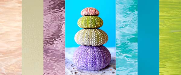
If you're looking for a little inspiration, take a look at this beautiful sea-inspired palette featuring six Oceanside Compatible COE 96 fusible glass styles. Soft blues, watery textures, fresh green, creamy neutrals, pale purple, and a touch of pink come together to create a palette that feels both colorful and calming.
The best part? You don't have to use all six colors in one project. Think of this palette as a starting point for your own color combinations.
Meet the Color Palette:
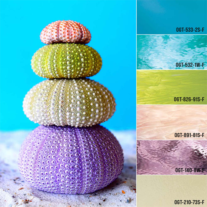
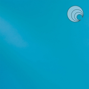
Blue Topaz Transparent
Start with Blue Topaz Transparent for a beautiful watery blue.
Because it's transparent, it can add depth and allow layers or design elements underneath to show through. Use it as a primary color, an accent, or a background element when you want a little extra dimension.
Think: water, sky, waves, bubbles, and ocean-inspired backgrounds.
Caribbean Blue Waterglass
The texture of Caribbean Blue Waterglass adds movement to the palette.
Waterglass is especially fun when you're looking for a surface that adds visual interest without introducing another color. The textured surface can suggest rippling water, waves, or movement.
Think: water, waves, beach scenes, and abstract designs.
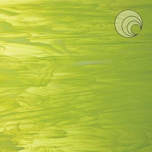
Lime Green & White Wispy
Bring in a little nature with Lime Green & White Wispy.
The combination of green and white creates a softer, more organic look than a solid color. The wispy variation also means the glass can add movement and visual texture to your design.
Think: sea grass, leaves, plants, gardens, and natural landscapes.
Vanilla Cream Opal
Every color palette needs a good neutral, and Vanilla Cream Opal fills that role beautifully.
A soft cream can help balance brighter colors while giving your design a warm, light element. It can also stand on its own when you want something simple and understated.
Think: sand, shells, clouds, highlights, and neutral backgrounds.
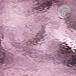
Pale Purple Waterglass
Add a little unexpected color with Pale Purple Waterglass.
The soft purple works beautifully alongside the blues and creams while bringing another layer of texture to the palette.
Think: sea glass, twilight skies, flowers, shells, and whimsical accents.
Pink Champagne & White Wispy
Finish the palette with Pink Champagne & White Wispy.
The soft pink and white combination adds warmth and a subtle pop of color. It works especially well as an accent when you don't want your project to feel overly bright.
Think: seashells, coral-inspired designs, flowers, sunsets, and delicate details.
Mix, Match & Make It Your Own
One of the easiest ways to create a cohesive glass project is to choose three or four colors that work well together rather than trying to use every color available.
Here are a few combinations to try:
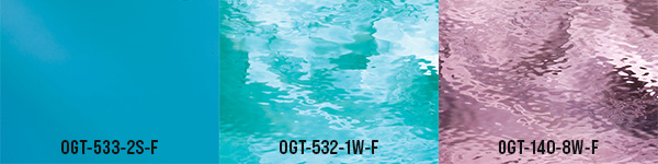
Cool & Watery
533-2S-F Blue Topaz Transparent
532-1W-F Caribbean Blue Waterglass
140-8W-F Pale Purple Waterglass
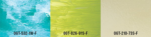
Fresh & Natural
532-1W-F Caribbean Blue Waterglass
826-91S-F Lime Green & White Wispy
210-73S-F Vanilla Cream Opal
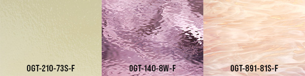
Soft & Playful
210-73S-F Vanilla Cream Opal
140-8W-F Pale Purple Waterglass
891-81S-F Pink Champagne & White Wispy
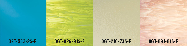
Colorful Coastal
533-2S-F Blue Topaz Transparent
826-91S-F Lime Green & White Wispy
210-73S-F Vanilla Cream Opal
891-81S-F Pink Champagne & White Wispy
And remember: you don't have to follow the palette exactly. Use it as a jumping-off point and substitute colors you already have in your glass stash.
Let the Colors Inspire Your Design
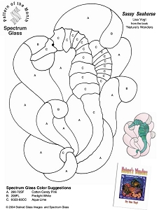
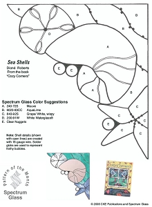
We've paired this color palette with four of our free stained glass patterns to help get those creative ideas flowing:
These patterns are a great place to start if you're new to glass art or simply looking for your next project. You can follow the pattern's basic design while experimenting with your own color placement and combinations.
You can also take the same color inspiration in a completely different direction. Think botanical designs, flowers, abstract panels, landscapes, jewelry, decorative pieces, or your own original creations.
A Little Color Planning Goes a Long Way
If you're a beginner, choosing glass doesn't have to be complicated.
A simple formula is:
Choose a main color → add a contrasting color → finish with a neutral or lighter accent.
Then look at texture and glass style. Pairing a transparent with a textured Waterglass or a wispy glass can make a project much more interesting without adding more colors.
That's what makes this palette so versatile. The colors coordinate, but the different glass styles give each one its own personality.
Ready to Start Creating?
All six Oceanside Compatible COE 96 glass styles featured in this palette are available from SW Art Glass.
Whether you're making a sea-inspired piece or simply looking for a fresh color combination, we hope this palette gives you a little inspiration for your next glass project.
Pick a few colors, grab a pattern, and start creating!
Tagged Products